Klimt vs Schiele vs Mucha: Which Art Nouveau Artist Belongs on Your Wall?
You love Art Nouveau, but Klimt, Schiele, and Mucha suit wildly different homes. Here's how to choose.

Most people see "Art Nouveau" and reach straight for The Kiss. But Klimt, Schiele, and Mucha created three radically different aesthetics, and the wrong choice can leave a beautiful print feeling stranded in the wrong room. This is a buyer's guide, not an art history lecture: which of these artists actually belongs in your home?
Three artists, three very different vibes
Klimt, Schiele, and Mucha worked within overlapping circles in turn-of-the-century Vienna and Paris, but their work pulls in opposite directions. Klimt is opulent and ornamental, all gold and pattern and slow romance. Schiele is jagged, raw, and emotionally exposed, with line work that feels like it was drawn yesterday. Mucha is decorative and theatrical, built around soft pastels, flowing hair, and floral borders.
You can love all three. You probably shouldn't hang all three the same way. The trick is matching the artist to the room, the light, and honestly, the kind of person you are when you're at home.

Gustav Klimt: ornamental gold, intimacy, and opulence
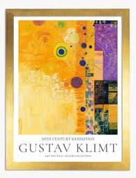
Klimt's art style is officially classified as Vienna Secession, the Austrian offshoot of broader European Art Nouveau. The Vienna Secession broke from academic painting in 1897, and Klimt led it. So when people search "klimt art nouveau," they're really asking about his Golden Phase, the period between roughly 1899 and 1910 where he layered actual gold leaf into oil paintings, drawing heavily from Byzantine mosaics he'd seen in Ravenna.
The palette is unmistakable: burnished gold, bronze, warm ochre, deep emerald, oxblood red, and ink black. Faces and hands are rendered in soft, naturalistic flesh tones, but everything else collapses into pattern. Eyes everywhere. Spirals, squares, eggs, lozenges.
What Klimt actually feels like in a room
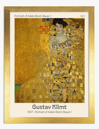
Klimt brings warmth and density. He doesn't whisper. A large Kiss or Portrait of Adele Bloch-Bauer I in a small, pale room can feel like a thrown brick. But put the same print in a dining room with moody walls, brass fixtures, and warm lighting, and it sings.
The best Klimt artworks for the home, in our view, are The Kiss, Adele Bloch-Bauer I, Water Serpents II, The Tree of Life, and Judith and the Head of Holofernes. The Tree of Life is the most versatile of the lot, because the gold pattern reads as decorative rather than figurative. You can put it almost anywhere.
Where Klimt struggles
Cold, ultra-minimalist spaces. White walls, grey sofa, no warmth in the lighting. Klimt's gold needs something to bounce off, whether that's a coloured wall, a wood floor, or warm lamplight. In a stark space he can look like a museum gift shop poster rather than the centrepiece he's meant to be.
Egon Schiele: raw emotion and expressive line work
Schiele was Klimt's protégé, and you'd never guess it from the work. Where Klimt smothers his figures in pattern and gold, Schiele strips them down to bone, sinew, and twitching line. His self-portraits and nudes feel almost uncomfortably present, like someone making eye contact for too long.
The palette is muted and earthy: chalky flesh tones, rust orange, mustard yellow, ink black, off-white paper, and the occasional bruised purple or arterial red. There's almost no decoration. Just line, posture, and negative space.
What Schiele actually feels like in a room
Schiele suits spaces that already have personality. Creative studios, home offices, modern lofts with exposed brick or concrete, masculine bedrooms, hallways with character. His work is intimate, which means it rewards being seen close up, so corridors and stairwell walls are surprisingly good places for him.
Seated Woman with Bent Knee, Self-Portrait with Physalis, and Four Trees are the gateway Schieles. Four Trees in particular is the easiest to live with, because it's a landscape rather than a figure study, and it carries all the emotional weight of his portraits without the discomfort of a stranger staring at you over breakfast.
Where Schiele struggles
Family rooms with kids. Many of his most famous works are nudes, and they're not the soft, classical kind. They're confrontational. Be honest about whether you actually want that energy in a shared living space, or whether his landscapes and townscapes might be the better choice for the lounge. Save the figure studies for a study or bedroom.
Browse our Egon Schiele prints and pay attention to the landscape works if you want Schiele's line quality without the intensity.

Alphonse Mucha: decorative elegance and pastel palettes
Mucha is the odd one out geographically (Czech, working mostly in Paris) and stylistically. He's the artist behind the lithograph posters of impossibly elegant women framed by flowers, stars, and zodiac symbols. He essentially invented what most people picture when they hear "Art Nouveau poster."
The palette is soft and feminine: pale lavender, sage green, dusty pink, peach, cream, butter yellow, and muted gold accents. Lines are flowing and curvilinear, never harsh. Everything decorative is deliberate. Mucha designed for the poster format from the start, which means his work is built to be seen at scale and from a distance.
What Mucha actually feels like in a room
Mucha is the easiest of the three to live with because the palette is gentle and the imagery is purely beautiful. He suits bedrooms, dressing rooms, bathrooms (with proper ventilation), nurseries, and any space that leans bohemian, vintage, romantic, or feminine. He pairs beautifully with rattan, brass, velvet, and houseplants.
His four-piece series (The Seasons, The Times of Day, The Flowers, The Precious Stones) are absolute gold for a hallway or staircase wall, because they're designed to hang together. Zodiac, Reverie, and Job are the standalone classics.
Where Mucha struggles
Ultra-modern lofts, brutalist or industrial spaces, and minimalist interiors. Mucha needs softness around him. In a concrete-and-steel apartment he can look fussy or twee. He also doesn't love being the only decorative element in an otherwise stark room. He wants company: plants, textiles, vintage furniture, soft lighting.
Our full Alphonse Mucha collection sits within our broader Art Nouveau prints if you want to see the range.
Which rooms suit which artist
Here's the short version, with the caveat that good rules exist to be broken thoughtfully.
Klimt belongs in: dining rooms, master bedrooms, formal lounges, dressing rooms, and entryways with depth and warm tones. He pairs best with mid-century modern furniture, dark wood, brass, jewel-toned velvets, and Art Deco accents.
Schiele belongs in: home offices, studies, creative studios, modern bedrooms (singles or couples without kids in the room), hallways, and characterful stairwells. He works with industrial materials, leather, exposed brick, concrete, and minimalist Scandinavian furniture.
Mucha belongs in: bedrooms, nurseries, dressing rooms, bathrooms, soft sitting rooms, and any space with bohemian or vintage leanings. He pairs with rattan, brass, vintage rugs, houseplants, velvet, and pale painted walls in sage, blush, or chalky lavender.
Scale recommendations by artist
Klimt rewards scale. Go large. A 70x100cm framed Kiss commands a wall in a way that a 30x40cm version simply cannot. The gold needs room to breathe.
Schiele works at any scale, but his intimacy actually benefits from smaller formats. A 40x50cm Schiele drawing on a study wall feels like a private object. Push him to 100x150cm on canvas and the energy can tip from intimate to oppressive.
Mucha was designed for poster size from the very beginning. Around 50x70cm to 70x100cm is the sweet spot, large enough to see the detail in the borders, small enough to feel like the original lithographs.
Mixing all three on a gallery wall: does it work?
Yes, but only with discipline. The three artists share a turn-of-the-century sensibility and a love of the decorative female figure, but their palettes and energies clash if you just chuck them together.
If you want a Vienna Secession and Art Nouveau gallery wall, follow three rules. First, unify the framing. Same frame colour (we'd suggest natural oak or matte black) and same mount style across every piece. Second, balance the palette. If you're using a Klimt as the anchor, choose Schiele works with warm earth tones and Mucha pieces with deeper jewel accents rather than the palest pastels. Third, give Klimt the centre. He's the loudest, so let him be the gravitational point, with one or two Schieles and Muchas orbiting at smaller scales.
What doesn't work: equal-sized prints from all three in a strict grid. The styles fight for attention. Asymmetric arrangements with one dominant Klimt and supporting cast work much better.

Print format matters: how each artist looks on paper vs canvas
This is where reproduction quality genuinely matters, and where each artist behaves differently.
Klimt on paper vs canvas
Klimt's gold is the make-or-break factor. Cheap reproductions render the gold as flat yellow, which kills the entire effect. We print Klimt on thick matte giclée paper, which holds the warm gold tones and fine ornamental detail without any glare. Framed behind UV-protective acrylic, the gold reads as warm and luminous rather than glossy.
Canvas works for Klimt too, particularly for The Tree of Life and other pattern-heavy compositions where the texture adds depth. For portrait works like Adele, we'd lean towards framed paper, because the skin tones and fine facial details show better on a smooth matte surface.
Schiele on paper vs canvas
Schiele is paper, full stop. His work was made with pencil, charcoal, watercolour, and gouache on paper, and that's how it should be reproduced. The fine line work and the relationship between figure and negative space depend on the slight tooth of matte paper. Canvas flattens his lines and adds texture where there should be none.
A framed Schiele print in a slim black or natural oak frame is the format. Don't overthink it.
Mucha on paper vs canvas
Mucha designed for lithograph posters, so paper is the historically correct choice and our preferred format. The crisp lines, flat colour areas, and ornamental borders all read beautifully on matte giclée paper.
That said, Mucha works surprisingly well on canvas in larger formats (80x120cm and up), where the soft texture adds a vintage, slightly aged quality that suits the bohemian rooms he tends to live in. If you're going XL and unframed, canvas is a strong choice.
Our top picks from each collection
Klimt: The Kiss (the icon, but only if you have the room for it), The Tree of Life (the most versatile and easiest to style), and Portrait of Adele Bloch-Bauer I (the best Klimt for a dressing room or bedroom).
Schiele: Four Trees (the gateway Schiele, suits almost any room), Houses with Laundry (his townscape work, brilliant in a hallway), and Self-Portrait with Physalis (for a study or creative workspace).
Mucha: The Four Seasons series (a foolproof hallway or staircase set), Zodiac (the single most decorative Mucha), and Reverie (the calmest of his women, ideal for a bedroom).

A final note on choosing
If you're torn between all three, here's the honest test. Walk around your home and look at what's already on the walls, the floor, and the sofas. If you see warm tones, brass, velvet, and dark wood, choose Klimt. If you see clean lines, neutral palettes, and architectural materials, choose Schiele. If you see plants, vintage textiles, soft colours, and curves, choose Mucha. The art should agree with the room it's joining, not argue with it.
Buy one piece first. Live with it for a month. Then decide if you want to build out a gallery wall or let that single print stand alone. Most rooms only need one strong anchor, and all three of these artists are more than capable of being it.

Fab products featured in this blog
-
Gustav Klimt – Adele Bloch-Bauer Art Print
Translation missing: en.products.product.sale_price From £11.95£19.95 -
Gustav Klimt Abstract Elegance Art Print
Translation missing: en.products.product.sale_price From £11.95£19.95 -

Gustav Klimt – Fritza Riedler Art Print
Translation missing: en.products.product.sale_price From £11.95£19.95 -

Gustav Klimt Floral Garden Art Print
Translation missing: en.products.product.sale_price From £11.95£19.95 -
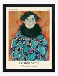
Gustav Klimt – Johanna Staude Art Print
Translation missing: en.products.product.sale_price From £11.95£19.95 -

Gustav Klimt Night Butterflies Blue Art Print
Translation missing: en.products.product.sale_price From £11.95£19.95 -

Klimts Floral Garden Art Print
Translation missing: en.products.product.sale_price From £11.95£19.95 -

Gustav Klimt Yellow Floral Garden Art Print
Translation missing: en.products.product.sale_price From £11.95£19.95 -

Gustav Klimt Poppy Garden Blossoms Art Print
Translation missing: en.products.product.sale_price From £11.95£19.95 -

Gustav Klimt Pink Floral Garden Art Print
Translation missing: en.products.product.sale_price From £11.95£19.95 -

Gustav Klimt Vibrant Landscape Art Print
Translation missing: en.products.product.sale_price From £11.95£19.95 -

Gustav Klimts Floral Symphony Canvas Print
Translation missing: en.products.product.sale_price From £44.95£74.95 -

Gustav Klimt Golden Green Flowers Dream Art Print
Translation missing: en.products.product.sale_price From £11.95£19.95 -
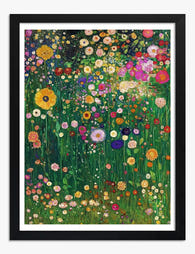
Klimts Floral Garden Art Print
Translation missing: en.products.product.sale_price From £11.95£19.95 -

Gustav Klimt’s Floral Garden Art Print
Translation missing: en.products.product.sale_price From £11.95£19.95 -

Gustav Klimt Flower Garden Art Print
Translation missing: en.products.product.sale_price From £11.95£19.95 -

Klimt’s Floral Symphony Art Print
Translation missing: en.products.product.sale_price From £11.95£19.95 -

Gustav Klimt Flower Garden Art Print
Translation missing: en.products.product.sale_price From £11.95£19.95 -

Gustav Klimt – Emilie Flöge Art Print
Translation missing: en.products.product.sale_price From £11.95£19.95


More from The Frame

Klimt's Beech Forest and Birch Forest Paintings...
Klimt's forests are having a moment, and the search results are a mess. People type in "beech forest poster" and end up looking at three different paintings with overlapping German...

The Story Behind Klimt's Woman in Gold: Adele B...
She has been called the Mona Lisa of Austria, looted by Nazis, fought over in court for decades, and sold for $135 million. The painting is dazzling, but the woman...

Klimt's Golden Phase Portraits: The Story Behin...
Gustav Klimt's Golden Phase lasted less than a decade, but it produced the most recognisable portraits in modern art. Before you hang one on your wall, it's worth knowing what...