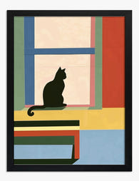
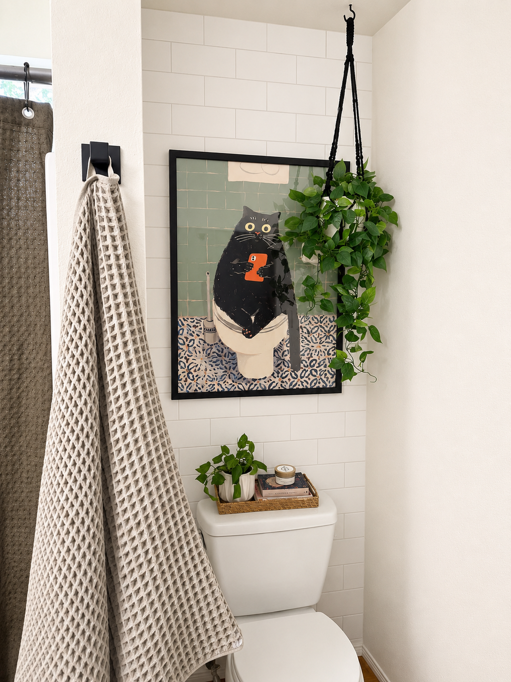
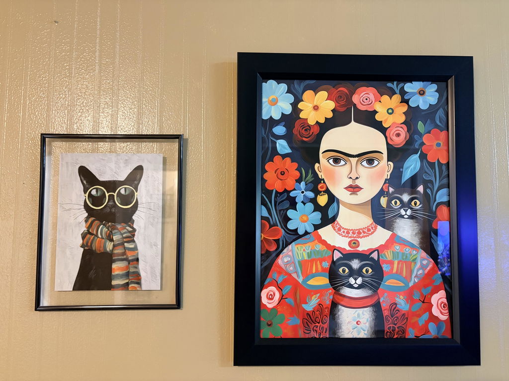
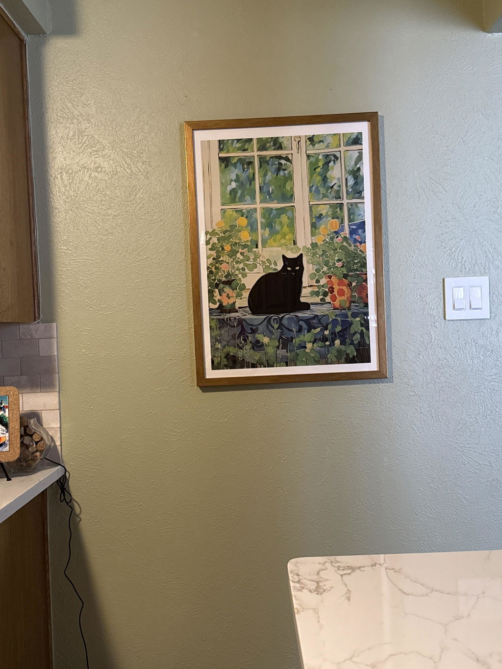
Solid wood. Professionally framed. Arrives ready to hang.
Make your print ready to hang.
Black Art Prints
4.8
Black does the heavy lifting on a wall: it anchors a busy room, sharpens a pale one and pulls a scattered gallery wall together. Here you'll find inky abstracts, high-contrast photography, bold typography and quiet single-line drawings. If you want the graphic end of the spectrum, the Black & White Line Art Prints are worth a look, while Monochrome Art Prints stretch the same mood into greys. Framed or unframed, both hang straight away.
The print is BEAUTIFUL! So vibrant. The only thing I wasn’t expecting was how stiff the rolled up print would be. Tipsor instructions on how to handle this in order to frame without damaging it would be so helpful.
Black prints are the secret weapon of gallery walls. They give you weight, contrast, and a built-in design system that almost any room can absorb. This guide walks you through...
Buying black art prints: your questions

Short answers on choosing shades of black, hanging placement, framing choices and what happens after you order
What's the difference between black abstract, line art and silhouette prints?
They differ in how much of the subject they show. Black abstract prints are non-representational, built from shapes, marks and texture rather than a recognisable object, so they carry the most visual weight and suit a focal wall. Line art describes a subject through outlines and contours with no shading and lots of open white space, making it the lightest, calmest option. Silhouettes sit between the two: the subject appears as one solid filled shape, readable only by its outer edge, which reads bold and graphic from across a room.
Are black art prints too intense for a bedroom, or can they still feel restful?
Black art prints can absolutely feel restful in a bedroom. A limited palette gives the eye fewer competing signals than busy multicoloured artwork, so the room reads calm rather than loud. For a soothing effect, favour open compositions, soft gradients or simple lines over dense, high-contrast detail, and save the boldest pieces for a side wall instead of directly above the bed. Warm textures like linen, wood tones and layered lamplight soften the contrast, and mounting or a light wood frame adds breathing room around the image.
Will black art prints make my room feel dark or small?
This is the most common concern we hear, and the answer is almost always no. Black wall art actually anchors a room and gives it depth, especially against lighter walls like white, warm cream, or soft grey. In a small bedroom or hallway, a single framed black print (around 50x70cm) creates a focal point that draws the eye and makes the space feel more intentional rather than smaller. The trick is not to overdo it. One or two black prints in a room with good natural light will feel dramatic and considered, not heavy.
What frame colour works best with black art prints?
We'd go with a black frame for a seamless, gallery-style look where the art feels like it extends to the edge. It's the most versatile option and works in virtually every room. If you want a bit of contrast and warmth, a natural oak frame is a great choice, particularly if your space already has wooden furniture or warm-toned flooring. Our frames are made from solid FSC-certified wood with UV-protective acrylic glazing, so whatever finish you pick, the print will look sharp and won't fade over time.
How do I style black prints in a living room without it looking too stark?
Pair your black prints for living room walls with textured soft furnishings to balance the contrast. A large black abstract print (we'd suggest 70x100cm) above a sofa with linen cushions in warm neutrals like sand, terracotta, or olive creates a sophisticated look that feels lived-in rather than clinical. Adding a low shelf or console beneath with a plant or candle softens the transition between art and furniture. The goal is to let the black artwork be the anchor while the surrounding textures do the warming.
Are these black prints true deep black, or do they look washed out in person?
Our black art prints are giclée printed on thick matte paper using museum-grade inks, which means the blacks are rich, dense, and full of depth. The matte finish eliminates glare so you see true colour from any angle, which is especially important with black artwork where a glossy surface would bounce light and flatten the tones. Shoppers regularly tell us their prints look even better in person than on screen. If you're replacing a cheaper print that looked grey or faded, the difference will be immediately obvious.
What colours and subjects pair well with black artwork on a gallery wall?
Black wall art is one of the easiest subjects to build a gallery wall around because it plays well with almost everything. Our favourite pairing is black prints mixed with muted earth tones like dusty pinks, warm beiges, or deep greens for a gallery wall that feels curated rather than random. For a more minimalist approach, stick to two or three black and white prints alongside one colour accent piece. Start with a large black print (50x70cm or bigger) as your anchor, then build outward with smaller complementary pieces. Keep frames consistent for a polished finish.
Choosing a selection results in a full page refresh.